Introduction
The HistData package collects data behind some of the
most important graphics in the history of statistics and data
visualization. Some of these still have stories to tell, and lessons for
historians, graphic designers and software developers.
I consider the package as a concrete, usable contribution to a
program of research I call statistical historiography: The use
of modern statistical and graphic methods as tools to study problems and
questions in the history of statistics and and data visualization. A
main goal of this is a better understanding of historical problems in
science and data analysis through the process of trying to
reproduce a graph or analysis using modern methods.
You are led to ask— and think about— important questions of
statistical historiography:
What was he thinking?: How and why Charles Joseph
Minard, Luigi Perozzo, John Snow, Michael Florent van Langren and other
heroes in data visualization history chose some graphic form to tell
their story.
How did he do it?: The contributions of the past were
mostly hand-drawn, but with incredible attention to detail:
text labels on lines, curves, regions; drawn numbers to show the data;
annotations to add sense to scales or convey the message more directly
to the viewer.
Why was the resulting graphic considered so beautiful and
important?: Each of these datasets and their associated graphics
solved, or contributed to, an important problem of their time. But they
did so in a way that attracted attention and admiration
I call the process “re-visioning” – meaning to see again,
hopefully in a new light. As such, they provide opportunities, and
this HistData Challenge to reproduce them in R.
Challenges
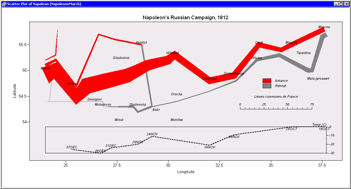
This idea first took shape the Minard Challenge that
stemmed from my paper Friendly (2002), “Visions and Re-Visions of
Charles Joseph Minard”. This reviewed decades of attempts – by many
different people, using many different tools – to reproduce and extend
Minard’s famous graphic of Napoleon’s Russian campaign. That paper, and
the gallery of re-visions that grew out of it, is the model for this
vignette: a catalog of kinds of re-vision, applied not just to
Minard but to any dataset in this package, plus a running inventory of
what’s already been attempted (in sandbox/, by outside
contributors, in companion projects) and what’s still open.
I should mention that the idea of a data visualization “Challenge” is
an important one in this age of online communication. Typically, they
present a dataset, or a content theme, or just an image, and invite
participants to participate; sometimes prizes are awarded.
Some examples illustrate the range of possibilities from such
endeavors:
ASA Statistical Graphics Expositions: starting
in the early 1980s – the well-known 1983 Data Exposition (Donoho &
Ramos’s cars/mpg dataset) is often cited as the first, though a 1982
precursor is also mentioned in some accounts – the Section on
Statistical Graphics of the American Statistical Association began a
series of poster/paper sessions at the Joint Statistical Meetings
organized around analysis of a single curated dataset, intended as an
opportunity to share perspectives, approaches to the problem, and
highlight developments in software. Some notable examples are the HistData::Pollen data
contained here and the baseball salary/performance data from the 1988 Exposition
(based on the 1986 season), now shipped in the vcd package
as vcd::Baseball.
Hotelling Society: I was teaching a graduate
course, Psychology
6140: Multivariate Data Analysis at the time, and I had the idea to
use the baseball data again to challenge my students to “strut their
stuff” and show off what they had learned in the course in a
mock-conference setting I called the “Society for Exploration of
Multivariate Data”, or, in honor of Harold Hotelling, the “Hotelling
Society”. I used the Baseball
dataset for this, with data provided in SAS and SPSS format.
But students were encouraged to extend the scope with other
baseball-related datasets or questions. Students dressed the part, a
“7th inning stretch” included beer and pizza, and a fictitious guest
speaker, Izzy A. Ringer, presented conclusive proof that Shoeless Joe
Jackson did NOT throw the 1919 World Series – the Black Sox Scandal, in
which Jackson and seven Chicago White Sox teammates were accused of
intentionally losing to the Cincinnati Reds. The upshot was that we all
had fun with this, and it contributed to understanding of use of methods
of the course and conveying results for a conference presentation.
The baseball data itself outlived the course: working with it for the
Hotelling Society is what led, eventually, to developing the Lahman R
package, which packages Sean Lahman’s baseball database directly for R
users – itself a small case of one challenge (teach a course, make the
data usable) turning into a durable, reusable piece of data for baseball
research. This is the same trajectory HistData itself
follows on a larger scale.
Kaggle
Competitions: machine-learning contests run on the Kaggle
data science platform, from beginner “Getting Started” competitions like
Titanic: Machine Learning
from Disaster (predict who survived, from passenger data) to
prize-money contests sponsored by companies and research groups. Not
about historical re-visioning specifically, but the same
competitive/participatory spirit – a public dataset, a shared task, and
a leaderboard of attempts to compare against.
MakeoverMonday:
probably the closest in spirit to this vignette’s own idea of
re-visioning. Started in 2016 by Andy Kriebel and Eva Murray, a new
dataset – almost always one already published somewhere as a chart,
often a mediocre one – is posted every Sunday, and participants are
asked “to work with a given data set and create better, more effective
visualizations and help us make information more accessible.” Where
30DayChartChallenge and TidyTuesday hand you a bare dataset,
MakeoverMonday hands you an existing graphic and asks you to
improve on it – the same path this vignette takes with Minard, Perozzo,
and Snow, just aimed at recent charts instead of historical
ones.
30DayChartChallenge:
one chart a day for the month of April, each day keyed to a themed
prompt (e.g. “part-to-whole,” “historical,” “3D”). Started in 2021 by
Cédric Scherer and Dominic Royé as a follow-on to the
#30DayMapChallenge. John Russell’s recreations of several
HistData datasets, used throughout this vignette, came from
the 2025 edition – see the sandbox/ inventory
below.
TidyTuesday:
a weekly data project run by the R4DS (“R for Data Science”) online
learning community since 2018 – a new real-world dataset posted every
Monday, participants share their own wrangling/visualization of it. Less
about re-visioning one specific historical graphic and more about
practicing data skills on whatever dataset comes up that week.
#DuBoisChallenge:
launched in 2021 by Allen Hillery, Anthony Starks, and Sekou Tyler
specifically to recreate W. E. B. Du Bois’s hand-drawn data
visualizations from the 1900 Paris Exposition using modern tools.
Closest in spirit to this vignette’s own framing of all the challenges
above – explicitly about revisiting one historical body of graphic work,
not a general prompt-of-the-day format.
A tiny motivating example: Arbuthnot
Before anything as ambitious as tackling Minard or John Snow, a
simple example makes a small point of statistical historiography
concretely. John Arbuthnot’s 1710 table of annual christenings in London
(1629-1710) looks, on a first read, like a straightforward count. But
Sandy Zabell (1976) found that the total number of
christenings (Males + Females) for 1674 and
1704 are identical – not approximately close, identical, down
to the last birth – strongly suggesting one year’s entry was copied from
the other, whether by Arbuthnot himself or a later transcriber.
data(Arbuthnot)
Arbuthnot$Christenings <- Arbuthnot$Males + Arbuthnot$Females
Arbuthnot[Arbuthnot$Year %in% c(1674, 1704),
c("Year", "Males", "Females", "Christenings", "Ratio")]
| 46 |
1674 |
6113 |
5738 |
11851 |
1.065354 |
| 76 |
1704 |
6113 |
5738 |
11851 |
1.065354 |
Males, Females, Christenings,
and the derived Ratio all match exactly; only
Plague and Mortality (not shown) differ. A
table alone makes this easy to miss among 82 rows. Plotting
Christenings by Year makes it much harder to
miss: the series climbs steadily over these 80 years, nearly doubling,
so a value perfectly ordinary for the 1670s becomes a jarring plunge
when it recurs, unchanged, thirty years later. The horizontal line marks
the shared level. And, following Zabell & Wainer’s Figure 2 (2002),
shows it passing through only these two points:
copy_level <- Arbuthnot$Christenings[Arbuthnot$Year == 1704]
ggplot(Arbuthnot, aes(x = Year, y = Christenings)) +
geom_line(color = "grey50") +
geom_point(color = "grey50") +
geom_hline(yintercept = copy_level, linetype = "dotted", color = "black") +
annotate(
"segment", x = 1677, xend = 1701, y = copy_level, yend = copy_level,
color = "darkred", linewidth = 1.3,
arrow = arrow(length = unit(0.3, "cm"), type = "closed")
) +
geom_point(
data = subset(Arbuthnot, Year %in% c(1674, 1704)),
color = "firebrick", size = 4
) +
labs(
title = "Arbuthnot's annual christenings in London, 1629-1710",
subtitle = "1674 and 1704 (red) are identical -- likely a copying error",
y = "Christenings (Males + Females)"
) +
theme_minimal()

Christenings, not the sex Ratio
(Males/Females), is the quantity that makes
the anomaly visible, even though Ratio also matches exactly
between the two years. Since Males and Females
were copied together, their ratio just reproduces 1674’s
perfectly ordinary value – nothing in the Ratio series
flags 1704 as unusual. (The one genuinely striking Ratio
value in this stretch, 1703’s record low of 1.011, is unrelated noise,
no part of this story.) It’s Christenings, because it
climbs steadily across the whole span, that turns a copying error into a
visible outlier – exactly the quantity Zabell & Wainer’s Figure 1
plots (2002).
That’s re-visioning in miniature: looking again at old data,
graphically, shows something tabulation alone hides. Zabell & Wainer
(2002) state the scale of the
anomaly plainly: 1704 has about 4,000 fewer christenings than its
neighbors predict, and the correct figure – 15,895 (8,153 boys, 7,742
girls) – sits comfortably between 1703 and 1705, exactly where a
corrected value should. Arbuthnot, they argue, would surely have caught
and fixed so glaring an error had he ever plotted his own data: graphed,
it stands out “literally, like a sore thumb.”
That he apparently never did is itself a historiographic finding, not
a personal failing: it’s evidence that graphing data simply wasn’t yet
part of a statistician’s toolbox in 1710, before Playfair invented the
line graph in his Commercial and Political Atlas (1786).
Re-visioning the graph doesn’t just fix a 300-year-old data error; it
exposes a working assumption of Arbuthnot’s era that no longer holds
today.
See Zabell (1976) for the original discovery and
an earlier version of this graph, Zabell & Wainer (2002) for
the fuller published account excerpted above, and Wainer & Spence
(2005) for a
further retelling.
The graph above could be improved to tell a richer historical story –
1704 is far from the only irregularity in it, just the only one without
an obvious explanation. Zabell & Wainer’s own Figure 1 (2002)
labels several other anomalies directly on the plot:
- 1643-1660:
Christenings falls from
about 10,400 in 1642 to a low of 5,612 in 1650 – nearly halved –
coinciding with the English Civil War (1642-1651) and the execution of
Charles I in 1649. Timing alone doesn’t fully explain it, though: the
war ended in 1651, yet the series doesn’t climb back past 10,000 until
1662, over a decade into the Interregnum and Restoration. Zabell &
Wainer note that Graunt himself offered a more complex account: Anglican
ministers, in this politically fraught stretch, likely declined to
register children born to Catholics or Protestant dissenters. Civil war
explains the drop’s onset better than its decade-long persistence.
- 1665-1666: a sharper, shorter dip – from 11,722 in
1664 down to 9,972 in 1665 and 8,997 in 1666, before rebounding to
10,938 in 1667 – lines up with the Great Plague of London (1665, which
killed roughly a fifth of the city’s population) immediately followed by
the Great Fire of London (September 1666). Unlike the Civil War’s decade
of depressed numbers, this one snaps back within a year or two once the
immediate crises passed.
Neither needed a Zabell-style detective plot to explain – they’re
visible, dateable historical events, which is exactly why Zabell &
Wainer’s Figure 1 labels them directly rather than treating them as
mysteries. 1704 stood out precisely because it didn’t have an
obvious explanation like these – until the plot revealed it wasn’t a
historical event at all, just a clerical error.
What is re-visioning?
Historians of statistics have practiced “re-visioning” long before
this vignette put a name to it – going back to an original historical
graphic or dataset itself, not just its published conclusions, to
understand it on its own terms, in its own time. Some examples here
follow the same pattern as Arbuthnot above, at a larger
scale.
Stephen Stigler does this throughout The History of
Statistics (1986) and in papers devoted
specifically to it: “Francis Galton’s Account of the Invention of
Correlation” (1989) re-examines Galton’s own
scatter diagram of parent/child heights to work out how Galton actually
arrived at correlation, and “Regression Towards the Mean, Historically
Considered” (1997) does the same for Galton’s
geometric argument for regression – reconstructing the reasoning behind
a graphic, not just restating its result.
Stigler has also made the case for why this kind of
return-to-the-source work matters, not just demonstrated it. “Data Have
a Limited Shelf Life” (2019) traces three
textbook-famous datasets – Quetelet’s Scottish soldiers’ chest
measurements, von Bortkiewicz’s Prussian horse-kick deaths, and the
Cushny-Peebles sleep data behind Gosset’s first published
t-test – back to their original sources, and finds each one,
after decades of uncritical reuse, had drifted away from the messy,
selective, error-ridden reality of its collection into something merely
“ornamental”: a fixed textbook prop, its provenance and caveats long
forgotten (Gosset’s own data, for instance, reached Fisher’s textbook
with two columns mislabeled as the wrong drugs entirely, an error nobody
caught for 27 years). Old, dead data aren’t worthless, he’s careful to
add – like museum pieces, their value is just a different kind from a
live dataset still doing scientific work – but he warns that “big data”
is no less susceptible to going “ornamental,” and may be harder to
catch: “dead data do not represent the worst case; zombie data may be
even worse for scientific use.” Re-visioning, in this vignette’s sense,
is exactly the antidote he’s calling for: asking where a dataset
actually came from is what keeps it from going ornamental in the first
place.
David Bellhouse (with Laura Murray) does something similar for a much
earlier and more painstaking case: Murray & Bellhouse (2017)
work out how Edmond Halley actually constructed his 1701 map of magnetic
declination – a map, not a table – using only the methods and
instruments available to Halley at the time.
James Hanley (McGill)
has made a research program out of exactly this kind of
return-to-the-source work, publishing detailed re-analyses and
re-created datasets that go well beyond what the original publications
contained. Two examples tie directly into HistData:
- Hanley, Julien & Moodie (2008), “Student’s z, t, and s: What
if Gosset had R?,” traces the height and finger-length data originally
gathered by Macdonell (1901) and used by “Student” (Gosset, 1908) to
introduce the t-distribution – the same data shipped here as
HistData::Macdonell.
- Hanley’s re-enactment of
Gosset’s yeast-cell counting, following the method described in
Gosset’s 1907 Biometrika article, connects directly to
HistData::Yeast – also the subject of John Russell’s
sandbox/Yeast.R recreation, picked up again in the case
studies below.
Digital history
Martin Grandjean’s “The Digital Historian’s Craft” (2026)
makes the case at the level of the whole discipline: digital methods are
new tools in the historian’s kit, to be appreciated for what they bring
to telling the story. Using them well remains a modern, personal craft
at the crossroads of technical mastery and the older skills of source
criticism, interpretation, and synthesis. Re-visioning, as practiced in
this vignette, is one small corner of that same craft.
A taxonomy of re-visions
The gallery accompanying Friendly (2002), https://www.datavis.ca/gallery/re-minard.php, catalogs
about 15 different re-visions of the Minard graphic. I simply collected
them as found and wrote some words about them to say why they were
interesting. But this can be read as a checklist of features, rather
than a one-off catalog. Together, they sort into six recognizable
kinds of re-vision – a rubric that applies to any HistData
dataset, not just Minard’s.
1. Software/language ports
The same graphic, redrawn with different tools, each an opportunity
and challenge to express the drawing in software. The Minard Gallery
included examples using:
The content doesn’t change; what changes is what the choice of tool
reveals about the graphic’s underlying structure and how you think about
doing it in that language environment. A grammar-of-graphics
implementation, for instance, forces you to name the mapping from data
to mapping into visual channels explicitly, in a way the original
hand-drawn version never had to.
Data structures
A software port is only as easy as the data behind it allows, and
HistData deliberately pre-parses some of its more complex
datasets / graphics into separate, composable pieces rather than one
monolithic table or Excel file, with with multiple sheets or tables. In
a way, this is the same decomposition the original artist implicitly
made when laying out the figure, but without the need to think about how
a computer could understand it.
For example, Snow’s cholera map is really five aligned layers
(Snow.deaths, Snow.pumps,
Snow.streets, Snow.polygons,
Snow.dates), and Minard’s march is three
(Minard.cities, Minard.troops,
Minard.temp: places, the flow band itself, and the
temperature graph beneath it). Porting the graphic to a new tool becomes
a matter of re-mapping each existing piece onto that tool’s own
layer/channel model, rather than re-deriving the decomposition from
scratch. See the Minard case study below, built directly
from these three data frames.
2. Design variations
Same content, same tool family, different design decisions:
legibility fixes, a graphic designer’s redraw, an alternate visual
metaphor (Minard’s gallery includes a pictograph version emphasizing
human cost over cartographic accuracy). This is the category where taste
and communication goals do the most work.
3. Interactive/web-based
Tooltips, drill-down, linked views, map overlays: these are
re-visions that trade the fixed, printed page for something a reader can
query, interact with and explore. The Minard gallery includes an image
map with linked text and a drill-down SAS GMAP; this is also illustrated
for the plotly version of the Perozzo data
described below.
4. Temporal/animated
A step-by-step reveal, a third axis given over to time, a narrated
video. Minard’s original already compresses time into distance along the
march route; an animated re-vision instead lets time play out,
trading the compression for a different kind of legibility. (See “Open
invitations” below for the deferred gganimate idea for
Perozzo.)
A concrete example: Ron Kennett’s “moving bubble” animated re-vision,
which replaces Minard’s static flow band with a single traveling bubble
sized to the army’s current strength, sweeping along the march route as
time advances. (Image on file,
Kennet-moving-bubble.gif; embedding pending the general
image-hosting/licensing decision noted above.)
5. Alternative representations
A genuinely different chart type for the same underlying data: not a
redraw, a rethink– “How could I do this better?”. The
Snow-density.R case study below (density contours instead
of point symbols for cholera deaths) is this category in a small
example.
6. Data packaged for reuse
The original figures plus the underlying data, released in a form
someone else can build on. This is, quite literally, what the
HistData package itself does for all 34 of its datasets –
arguably the least glamorous but most consequential category, since
every other kind of re-vision in this list depends on having data to
play with first.
Case study: Minard
Minard drew his 1869 original by hand, in ink, as a single sheet: a
tapering flow band tracing the army’s size and location, paired with a
temperature graph along the same horizontal axis. Friendly (2002) catalogs
around 15 later re-visions of it, spanning every category in the
taxonomy above; this section builds one of them directly (a
software/language port), then points to gallery entries for a few
more.
A software/language port, built from
Minard.cities/Minard.troops/Minard.temp
As noted in “Software/language ports” above, the march itself
decomposes into Minard.cities (places),
Minard.troops (the flow band – each row a vertex,
survivors giving the band’s width, direction
its color, group which sub-path it belongs to), and
Minard.temp (the temperature series, not used in this
panel). Porting to ggplot2 is then mostly a matter of mapping
survivors to linewidth and
direction to colour:
data(Minard.cities); data(Minard.troops)
ggplot(Minard.troops, aes(x = long, y = lat)) +
geom_path(aes(linewidth = survivors, colour = direction, group = group),
lineend = "round") +
scale_linewidth(range = c(0.5, 15), guide = "none") +
scale_colour_manual(values = c(A = "grey50", R = "firebrick"), guide = "none") +
geom_point(data = Minard.cities, size = 1.2) +
geom_text(data = Minard.cities, aes(label = city), vjust = 1.5, hjust = 0.5, size = 3) +
labs(title = "Napoleon's Russian campaign of 1812", x = NULL, y = NULL) +
theme_minimal() +
theme(axis.text = element_blank(), panel.grid = element_blank())

Grey is the advance on Moscow, red the retreat; band width still
carries troop strength, exactly as in the 1869 original. Not shown here
is the separate graph of the decline in temperature Napoleon’s troops
suffered on the retreat, contained in
HistData::Minard.temp. The help file ?Minard shows
ggplot2 steps for both together, and for combining these
into a single graphic.
Wilkinson’s GoG specification
Minard’s graphic has a more important claim to fame beyond the many
re-visions described here: Leland Wilkinson used it as a capstone
illustration of The Grammar of Graphics (1999):
Proof that a formal grammar could specify a graphic this intricate (a
tapering, bidirectional flow band keyed to two variables at once,
sharing its horizontal axis with an aligned temperature series)
compactly enough to state once, and precisely enough for a computer to
draw it unassisted.
He used this version as cover image for the book. He was saying,
“HELLO WORLD: I can do this!!”. See (Friendly 2022) for an
account of my conversation (Colorless Green Graphs Sleep
Furiously) with Lee about the thinking that went into his work on
the grammar of graphics.

Wilkinson’s rendering of Minard’s map
(Wilkinson, 1999, Fig. 15.1)
His code for this comprised dplyr-like
TRANSformation steps, followed by two FRAMEs
for the flow portion and the subscripted line graph of temperature on
the retreat.
TRANS: date = miss(date, lont, "linear")
TRANS: ldate = lag(date, -1)
TRANS: days = diff(date, ldate)
FRAME: lonc*latc
GRAPH: point(label(city), size(0))
GRAPH: path(position(lonp*latp), size(survivors), color(direction),
split(group))
GUIDE: legend(color(direction))
FRAME: lonc*temp
COORD: stretch(dim1, dim2, 1, .2)
COORD: translate(dim1, dim2, 0, -.5)
GRAPH: path(position(lont*temp), label(date), texture.granularity(days),
color.brightness(.5))
GUIDE: axis1(label("Longitude"))
GUIDE: axis2(label("Temperature"))
Set next to the ggplot2 call above, the correspondence
is nearly line-for-line:
GRAPH: path(position(lonp*latp), size(survivors), color(direction), split(group))
is
geom_path(aes(x = long, y = lat, linewidth = survivors, colour = direction, group = group))
– the same data-to-channel mapping (position, size, color, grouping),
just spelled in a different grammar’s syntax. ggplot2, as a
direct implementation of Wilkinson’s grammar, doesn’t just resemble this
specification; it is a runnable version of it, decades on.
A few more, from the gallery
The rest of Friendly (2002)’s catalog isn’t reproduced
here (some entries are third-party work with licensing not yet sorted
out for redistribution – see
issues/vignettes/Minard-images.md), but is worth naming by
taxonomy category, all viewable at https://www.datavis.ca/gallery/re-minard.php:
- Design variation: Gene Zelazny’s pictograph
redesign – soldier silhouettes standing in for the flow band, a Napoleon
portrait and Moscow’s onion domes flanking the numbers, thermometer
icons instead of a temperature line. Same data, a completely different
set of design decisions about what to foreground.
- Interactive/web-based: a Protovis port overlaying
the flow band directly on a pannable, zoomable Google Map of the actual
terrain – the natural next step past a static basemap, and in the same
category as the
plotly version of Perozzo
above.
- Temporal/animated: Ron Kennett’s moving-bubble
re-vision, already named in the taxonomy section above.
Case study: Perozzo
Perozzo’s 1880/1881 stereogram plots survivor counts as a surface
over Year x Age, and does it by hand, in ink,
with its own four-way legend (“Sistema d’Assi”): black for the age
cross-sections, red for the census-year cross-sections, dashed lines for
isodemic (equal- population) contours, and violet for the
cohort-survivorship diagonals themselves.
A peculiar feature in this graph is the dip in younger people from
about 1850-1870 – it looks like someone chipped off a large chunk of the
mountain. What could be the reason? Several demographer friends
speculated: perhaps a war, or an outbreak of disease? It turns out that
the probable explanation is less dramatic: Sweden saw large-scale
emigration (much of it to North America) over this period, thinning out
exactly the young-adult cohorts that show the dip. Friendly & Wainer
(2021) (8.4) discuss this
feature of the stereogram directly.

Perozzo’s 1881 stereogram
The package supplies a simple base-R version already:
data(Perozzo)
Pmat <- xtabs(Survivors ~ Year + Age, data = Perozzo)
years <- as.numeric(rownames(Pmat))
ages <- as.numeric(colnames(Pmat))
The most basic example, from the documentation, shows a simple
perspective plot (graphics::persp()) of the 3D surface.
Some fiddling was necessary to get the orientation approximately
right.
ages_rev <- -rev(ages)
Pmat_rev <- Pmat[, rev(seq_along(ages))]
persp(years, ages_rev, Pmat_rev,
xlab = "Year", ylab = "Age", zlab = "Survivors",
theta = 0, phi = 25, expand = 0.6,
col = adjustcolor("lightblue", alpha.f = 0.5), shade = 0.5)

That base plot loses most of what makes Perozzo’s original worth
looking at: no sense of the steep “wall” of large numbers at
Age = 0, no highlighted reference lines, and no cohort
diagonals at all.
All four are answerable directly with persp(), without
leaving base R – it returns a 4x4 projection matrix from each call, and
trans3d() + lines() can then draw more
3D-located lines onto the same plot after the fact.
colnames(Pmat_rev) <- as.character(ages_rev) # match column names to ages_rev's sign flip
# re-angled to bring the Age = 0 "wall" of large young-survivor counts forward
pmat <- persp(years, ages_rev, Pmat_rev,
xlab = "Year", ylab = "Age", zlab = "Survivors",
theta = -30, phi = 20, expand = 0.6, r = 4,
col = adjustcolor("lightblue", alpha.f = 0.4), shade = 0.5)
# red: highlight both cross-section families -- Survivors-by-Age at each Year,
# and Survivors-by-Year at each Age -- every 25 years/years-of-age
hi_years <- years[years %% 25 == 0]
for (yr in hi_years) {
z <- Pmat_rev[as.character(yr), ]
lines(trans3d(rep(yr, length(ages_rev)), ages_rev, z, pmat), col = "red", lwd = 2)
}
hi_ages <- ages[ages %% 25 == 0]
for (ag in hi_ages) {
z <- Pmat_rev[, as.character(-ag)]
lines(trans3d(years, rep(-ag, length(years)), z, pmat), col = "red", lwd = 2)
}
# blue: birth-cohort diagonals -- Year = birth year + Age -- every 25 years,
# starting from the Age = 0 edge (cohorts born during the observation window)
# and the Year = 1750 edge (cohorts already alive when it starts)
cohort_starts <- rbind(
data.frame(year0 = years[years %% 25 == 0], age0 = 0),
data.frame(year0 = 1750, age0 = ages[ages %% 25 == 0 & ages > 0])
)
for (i in seq_len(nrow(cohort_starts))) {
b <- cohort_starts$year0[i]
a0 <- cohort_starts$age0[i]
k <- 0:((100 - a0) / 5)
Y <- b + 5 * k
A <- a0 + 5 * k
keep <- Y >= min(years) & Y <= max(years) & A <= 100
Y <- Y[keep]; A <- A[keep]
if (length(Y) < 2) next
z <- mapply(function(y, a) Pmat[as.character(y), as.character(a)], Y, A)
lines(trans3d(Y, -A, z, pmat), col = "blue", lwd = 2)
}

Red isn’t an arbitrary choice: it’s Perozzo’s own color for the
census-year cross-sections (see the original image above). Blue is a
substitute for his violet, used here for the cohort-survivorship
diagonals instead, since violet on top of the light-blue surface shading
was too easily lost. Those diagonals are the real payoff: each blue line
is a single Swedish birth cohort, and you can read its survivorship
directly off the line’s height as it recedes into the surface,
generation by generation – the “crucially” bit that a same-year
cross-section alone can’t show.
Re-vision 1: ggplot2 raster + contour
A straightforward “alternative representation” re-vision: give up the
3D illusion entirely in favor of a 2D heatmap with isolines, which
trades the stereogram’s dramatic silhouette for exact,
directly-comparable values.
ggplot(Perozzo, aes(x = Year, y = Age, z = Survivors)) +
geom_raster(aes(fill = Survivors)) +
geom_contour(color = "white", alpha = 0.6) +
scale_fill_distiller(palette = "Blues", direction = 1) +
scale_y_reverse() +
labs(title = "Perozzo's survivorship grid, as a heatmap") +
theme_minimal()

Re-vision 2: a fake-3D isometric shear
A “design variation”: keep the 3D look Perozzo was after,
but build it as an ordinary 2D ggplot via a manual isometric shear
(offsetting each Age slice horizontally and vertically as a
function of Age), rather than persp()’s true
3D projection. Unlike persp(), this gets full access to
ggplot’s color scales, legends, and layering.
shear <- 0.6 # horizontal points per year of age; tune to taste
lift <- 400 # vertical Survivors-units per year of age
Perozzo_iso <- transform(Perozzo,
x_iso = Year + shear * Age,
y_iso = Survivors + lift * Age
)
ggplot(Perozzo_iso, aes(x = x_iso, y = y_iso, group = Age, color = Age)) +
geom_line() +
scale_color_distiller(palette = "Blues", direction = 1) +
labs(
title = "Perozzo's stereogram as a 2D isometric shear",
x = "Year (sheared by Age)", y = "Survivors (lifted by Age)"
) +
theme_minimal() +
theme(axis.text.x = element_blank(), axis.text.y = element_blank())

The shear/lift constants are chosen by eye
for a legible “mountain” silhouette, not fit to Perozzo’s own oblique
axis convention – a stylized fake-3D, not a literal reproduction of his
projection geometry.
Re-vision 3: an interactive plotly surface
An “interactive/web-based” re-vision, and arguably the most direct
modern analogue of a physical stereogram: something a reader can
actually rotate, rather than a single fixed viewing angle.
library(plotly)
plot_ly(x = ~years, y = ~ages, z = ~Pmat, type = "surface") |>
layout(scene = list(
xaxis = list(title = "Year"),
yaxis = list(title = "Age"),
zaxis = list(title = "Survivors")
))
Still open
The one Perozzo idea from R/Perozzo.R’s
@details not attempted anywhere above is animating across
Year, letting each birth cohort’s diagonal “arrive” in
sequence rather than showing all of them at once (the
gganimate idea in “Open invitations” below).
Case study: Snow, via John Russell’s
30DayChartChallenge
Of the sandbox/ scripts recreating Russell’s 30DayChartChallenge
2025 entries, Snow-density.R was picked for this draft
because it needs no dependencies beyond ggplot2 (see
issues/vignettes/histdata-challenge.md for the full
dependency audit of every candidate script), and because it’s a genuine
“alternative representation” of one of the package’s most iconic
datasets: density contours instead of point symbols for cholera deaths,
layered over Snow’s original street map.
data(Snow.deaths); data(Snow.pumps); data(Snow.streets)
ggplot(Snow.deaths, aes(x = x, y = y)) +
geom_line(data = Snow.streets, aes(x = x, y = y, group = street),
color = "black", linewidth = 0.5) +
geom_point(alpha = 0.6) +
geom_density_2d_filled(bins = 4, show.legend = FALSE) +
geom_density_2d(bins = 4, color = "black", alpha = 0.6) +
scale_fill_manual(values = c("#FFFFFF00", "#F0808030", "#FF000030", "#8B000080")) +
geom_label(data = Snow.pumps, aes(x = x, y = y, label = label),
size = 3, color = "grey20", fill = "lightblue", alpha = 0.9) +
theme_void() +
labs(
title = "John Snow's Cholera Map",
subtitle = "With contour lines showing densities of death",
caption = "Data: HistData::Snow.deaths / Snow.pumps / Snow.streets"
)

Adapted from sandbox/Snow-density.R (originally: John
Russell, Challenge11.R).
References
Friendly, Michael. 2002.
“Visions and Re-Visions of Charles
Joseph Minard.” Journal of Educational and Behavioral
Statistics 27 (1): 31–52.
https://doi.org/10.3102/10769986027001031.
Friendly, Michael. 2007.
“A.-M. Guerry’s
Moral Statistics of France: Challenges for Multivariable Spatial
Analysis.” Statistical Science 22 (3): 368–99.
https://doi.org/10.1214/07-STS241.
Friendly, Michael. 2022.
Colorless Green Graphs Sleep Furiously: A
Conversation with Leland Wilkinson. Online, March 15, 2022.
https://nightingaledvs.com/colorless-green-graphs-sleep-furiously-a-conversation-with-leland-wilkinson/.
Friendly, Michael, and Howard Wainer. 2021.
A History of Data
Visualization and Graphic Communication. Harvard University Press.
https://doi.org/10.4159/9780674259034.
Grandjean, Martin. 2026.
“The Digital Historian’s Craft.”
In
Handbook of Digital and Computational Research Methods,
edited by Anders Koed Madsen and Anders Kristian Munk. Edward Elgar
Publishing.
https://doi.org/10.4337/9781802208993.00009.
Hanley, James A., Marielle Julien, and Erica E. M. Moodie. 2008.
“Student’s z, t, and s: What If Gosset Had
R?” The American Statistician 62 (1):
64–69.
Murray, Lori L., and David R. Bellhouse. 2017.
“How Was Edmond Halley’s Map of Magnetic Declination (1701)
Constructed?” Imago Mundi 69 (1): 72–84.
https://doi.org/10.1080/03085694.2017.1242841.
Playfair, William. 1786. Commercial and Political Atlas:
Representing, by Copper-Plate Charts, the Progress of the Commerce,
Revenues, Expenditure, and Debts of England, During the Whole of the
Eighteenth Century. Debrett; Robinson;; Sewell.
Stigler, Stephen M. 1986. The History of Statistics: The Measurement
of Uncertainty Before 1900. Harvard University Press.
Stigler, Stephen M. 1989.
“Francis
Galton’s Account of the Invention of Correlation.”
Statistical Science 4 (2): 73–79.
https://doi.org/10.1214/ss/1177012580.
Stigler, Stephen M. 1997. “Regression Towards the Mean,
Historically Considered.” Statistical Methods in Medical
Research 6 (2): 103–14.
Stigler, Stephen M. 2019.
“Data Have a Limited Shelf Life.”
Harvard Data Science Review 1 (2).
https://doi.org/10.1162/99608f92.f9a1e510.
Wainer, Howard, and Ian Spence. 2005. “Graphical Presentation of
Longitudinal Data.” In Encyclopedia of Statistics in
Behavioral Science. John Wiley & Sons.
Wilkinson, Leland. 1999. The Grammar of Graphics. Springer.
Zabell, S. 1976. Arbuthnot, Heberden and the Bills of
Mortality. Technical Report No. 40. Department of Statistics: The
University of Chicago.
Zabell, Sandy, and Howard Wainer. 2002.
“Visual
Revelations: A Small
Hurrah for the Black
Death.” CHANCE 15 (4): 58–60.
https://doi.org/10.1080/09332480.2002.10554828.